Xarray plot types#
Scott Wales, CLEX CMS
Let’s look at the different types of plots that are available using Xarray.
As usual we’ll start with some data from NCI
%matplotlib inline

import xarray
datapath = "http://dapds00.nci.org.au/thredds/dodsC/rr3/CMIP5/output1/CSIRO-BOM/ACCESS1-0/amip/mon/atmos/Amon/r1i1p1/latest/tas/tas_Amon_ACCESS1-0_amip_r1i1p1_197901-200812.nc"
data = xarray.open_dataset(datapath)
tas = data.tas.isel(time=0)
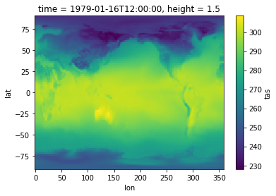
Calling .plot() on a xarray dataarray is a quick way to make a plot. It will choose a plot type based on the array dimension - if you get a histogram try reducing the number of dimensions using .sel() or .isel()
tas.plot()
<matplotlib.collections.QuadMesh at 0x7fb91828f240>
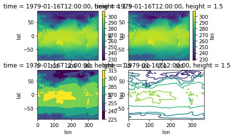
There are four basic plot types for 2d data
pcolormesh- colourised imageimshow- colourised imagecontourf- filled contourscontour- empty contours
pcolormesh and imshow are basically the same, but imshow has more control over the colours - you can for instance specify different arrays for the red, green and blue components
import matplotlib.pyplot as plt

ax={}
for i in range(4):
    ax[i] = plt.subplot(2,2,i+1)

tas.plot.pcolormesh(ax=ax[0])
tas.plot.imshow(ax=ax[1])
tas.plot.contourf(ax=ax[2])
tas.plot.contour(ax=ax[3])
<matplotlib.contour.QuadContourSet at 0x7fb918102ef0>
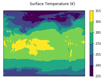
By default the plots come with a colour bar and title, however you can disable those in order to replace them with your own
tas.plot.pcolormesh(levels=7, add_colorbar=True, add_labels=False)

plt.suptitle("Surface Temperature (K)")
plt.tick_params(bottom=False, labelbottom=False, left=False, labelleft=False)
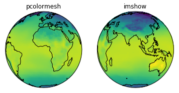
You can also specify the axis to create a plot on, which is useful for subplots and cartopy projections.
Note that while pyplot’s imshow() function only shows a rectangular image cartopy’s projections still work to project the data onto a globe
import cartopy.crs as ccrs

ax = [
    plt.subplot(121, projection=ccrs.Orthographic()),
    plt.subplot(122, projection=ccrs.Orthographic(central_longitude=90)),
]

ax[0].set_title('pcolormesh')
tas.plot.pcolormesh(ax=ax[0], transform=ccrs.PlateCarree(), add_colorbar=False, add_labels=False)
ax[0].coastlines()

ax[1].set_title('imshow')
tas.plot.imshow(ax=ax[1], transform=ccrs.PlateCarree(), add_colorbar=False, add_labels=False)
ax[1].coastlines()
<cartopy.mpl.feature_artist.FeatureArtist at 0x7fb901d736a0>