Subplots#
Scott Wales, CLEX CMS
Let’s make a more advanced plot, made up of several sub-plots and multiple colour bars:
temperature_plot()

We’ll plot the model mean temperature, as well as the difference from the mean for each season. A bit of basic analysis gets the temperature means.
I’m working on my desktop, so here the analysis is only over a single year. The chunks parameter to open_dataset() reduces the amount of data that gets read at once. The data doesn’t actually get read until needed, I’m manually calling .load() once I’ve filtered the data.
%matplotlib inline

import xarray
datapath = "http://dapds00.nci.org.au/thredds/dodsC/rr3/CMIP5/output1/CSIRO-BOM/ACCESS1-0/amip/mon/atmos/Amon/r1i1p1/latest/tas/tas_Amon_ACCESS1-0_amip_r1i1p1_197901-200812.nc"
data = xarray.open_dataset(datapath, chunks={'time':12})
tas = data.tas.sel(time=slice('1980','1981'))

tas_annual = tas.mean('time').load()
tas_seasonal = tas.groupby('time.season').mean('time').load()
Grouping by season has given a new season axis on the tas_seasonal data array
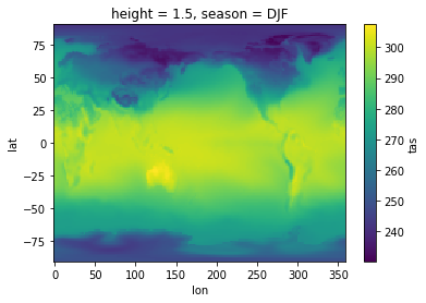
tas_seasonal.sel(season='DJF').plot()
tas_seasonal.season
<xarray.DataArray 'season' (season: 4)>
array(['DJF', 'JJA', 'MAM', 'SON'], dtype=object)
Coordinates:
    height   float64 1.5
  * season   (season) object 'DJF' 'JJA' 'MAM' 'SON'
I’d like to plot the annual mean alongside the difference from the mean for each season. I’d like a big plot for the annual mean, with smaller plots off to the side for each season.
This can be done using pyplot by creating a gridspec, then laying out subplots on the grid. Subplots can cover multiple cells of the gridspec, so I’ll start with a 2 x 4 grid, with the annual values covering the 2 x 2 cells on the left.
Just showing the axes for the moment lets me concentrate on the layout
import matplotlib.pyplot as plt
import matplotlib.gridspec as gridspec

fig = plt.figure(figsize=(10,4))

# Setup axes
gs = gridspec.GridSpec(2,4)
axs = {}
axs['annual'] = fig.add_subplot(gs[0:2,0:2])
axs['DJF'] = fig.add_subplot(gs[0,2])
axs['JJA'] = fig.add_subplot(gs[1,2])
axs['MAM'] = fig.add_subplot(gs[0,3])
axs['SON'] = fig.add_subplot(gs[1,3])

# Disable axis ticks
for ax in axs.values():
    ax.tick_params(bottom=False, labelbottom=False, left=False, labelleft=False)

With a nice looking layout I’ll now add some data.
Remember your data structures! I’m using a dict to hold all of the arrays, named by season. This means I can iterate over the seasons in tas_seasonal and grab the axes by name, rather than having to write out each plot one by one.
import numpy as np

fig = plt.figure(figsize=(10,4))

# Setup axes
gs = gridspec.GridSpec(2,4)
axs = {}
axs['Annual'] = fig.add_subplot(gs[:,:2])
axs['DJF'] = fig.add_subplot(gs[0,2])
axs['JJA'] = fig.add_subplot(gs[1,2])
axs['MAM'] = fig.add_subplot(gs[0,3])
axs['SON'] = fig.add_subplot(gs[1,3])

# Disable axis ticks
for ax in axs.values():
    ax.tick_params(bottom=False, labelbottom=False, left=False, labelleft=False)

# Add titles
for name, ax in axs.items():
    ax.set_title(name)

# Annual value
tas_annual.plot(ax=axs['Annual'], add_labels=False, add_colorbar=False)

# Anomalys
for s in tas_seasonal.season:
    (tas_annual - tas_seasonal.sel(season=s)).plot(ax=axs[np.asscalar(s)], add_labels=False, add_colorbar=False)
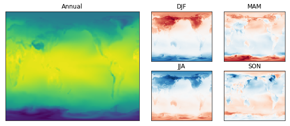
Finally let’s add some colour bars. We’re using two colour bars, so it’s helpful to create a new gridspec for them. This lets us easily adjust the spacing using the wspace parameter.
Also remember to make sure all the seasonal plots are using the same minimum and maximum colour values, otherwise the colourbar won’t be correct!
This is in a function so that I can make the plot at the top of the page
def temperature_plot():

    fig = plt.figure(figsize=(12,4))

    # Setup axes
    gs = gridspec.GridSpec(2,5,width_ratios=[1,1,1,1,0.4])
    axs = {}
    axs['Annual'] = fig.add_subplot(gs[:,:2])
    axs['DJF'] = fig.add_subplot(gs[0,2])
    axs['JJA'] = fig.add_subplot(gs[1,2])
    axs['MAM'] = fig.add_subplot(gs[0,3])
    axs['SON'] = fig.add_subplot(gs[1,3])

    # Disable axis ticks
    for ax in axs.values():
        ax.tick_params(bottom=False, labelbottom=False, left=False, labelleft=False)

    # Add titles
    for name, ax in axs.items():
        ax.set_title(name)

    # Annual value
    plots = {}
    plots['Annual'] = tas_annual.plot(ax=axs['Annual'], add_labels=False, add_colorbar=False)

    # Anomalys
    for s in tas_seasonal.season:
        s_name = np.asscalar(s)
        plots[s_name] = (tas_annual - tas_seasonal.sel(season=s)).plot(
            ax=axs[s_name],add_labels=False, add_colorbar=False, vmin=-20, vmax=20, cmap='RdBu_r'
        )

    # Colour bars
    cbar_gs = gridspec.GridSpecFromSubplotSpec(1,2, subplot_spec=gs[:,4], wspace=2.5)
    cax_annual = fig.add_subplot(cbar_gs[0,0])
    cax_seasonal = fig.add_subplot(cbar_gs[0,1])
    plt.colorbar(plots['Annual'], cax_annual)
    plt.colorbar(plots['DJF'], cax_seasonal)

temperature_plot()